
Transforming Your Data into a Compelling Story
/One question I often get asked teaching Storytelling with Data is, “What is the difference between data visualization and data storytelling?” This is a valid question. Industry-wide there has been a significant focus on perfecting and simplifying data visualization, yet much time hasn’t been spent on developing the storytelling process. It is presumptive to think that the presenter of the data visualization is wholly responsible for the story; in fact, the story starts building many steps before presentation.
Visual Data
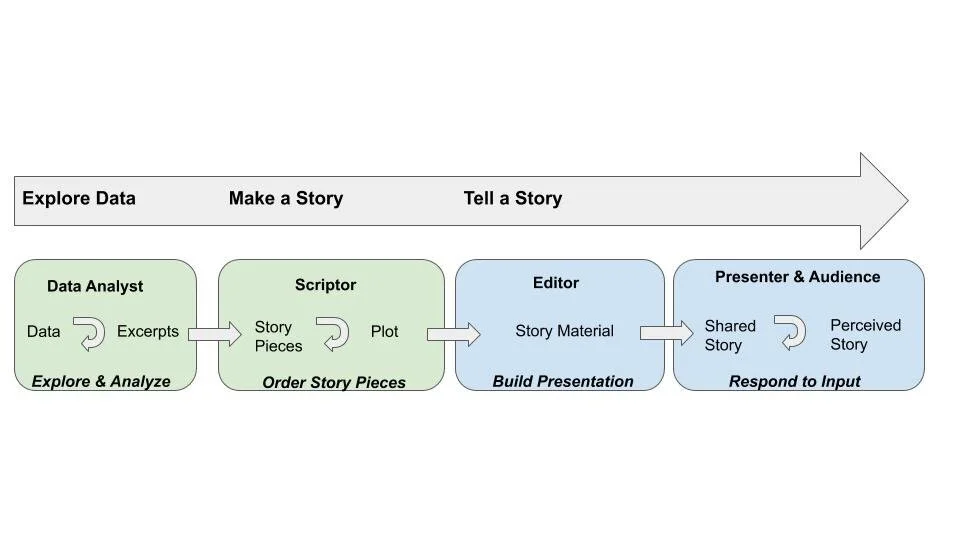
The diagram above is based on Robert Kosara and Jock McKinlay’s view of the storytelling process. We can see that the main phases are exploring data, making a story and then communicating that story. This process is no way linear in practice but very iterative as shown in the sub-processes carried out by roles involved in transforming the data to a compelling story.
The data analyst usually spends a lot of time extracting, analyzing and summarizing a data set that will support the hypothesis of a story. This process can take many iterations as a story is being developed.
The scriptor builds the plot by visualizing the data to support one or more of the intended points the presenter wants to make. Most likely the analyst is also the scriptor but there are times where the business team is using the excerpts to tell their story.
The editor prepares the story material. Again this can be a shared role the scriptor takes on but it can also be the person in charge of laying out the presentation in either a slide deck, infographic or video.
The presenter delivers the story. This can be the executive who is relaying insights to their management team.
Storytelling can be a broad term. According to an article published by IEEE, “Most descriptions of storytelling require some sort of controlled delivery or presentation of information.” I recall many times earlier in my career being asked to pull data on sales volume and summarize by month and product category and pass the spreadsheet along to our sales team. The process for me ended with the explore and analyze phase. Over time these types of requests have turned into graphing those trends to adding a few lines to summarize why these trends are being observed. We were beginning to order the story.
Getting back to our question on the difference between data visualization and data storytelling, the breakdown in the process happens between delivering excerpts and ordering the story pieces. Let’s walk through an example. First I pulled data on temperature trends for the first day of Fall in NYC for the last 5 years. I summarized the results below.
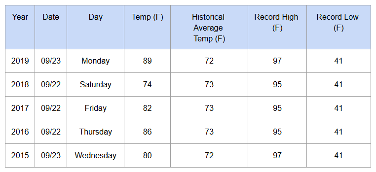
The story I’m looking to communicate is how NYC is experiencing warmer than normal temperatures during fall. Our first official day of autumn 2019 was 15 degrees higher than the normal temperature of 73 degrees. I wanted to see how we’ve been trending over the past 5 years. While the data table gives me an idea temperatures have been increasing over time, visualizing the trends will make it easier to see.

Looking at the visualization above, we’re starting to craft a story. The first thing that allows this data visualization to cross into the realm of data story is it’s title, “First Day of Fall in NYC has been above average for the past five years.” This title begins to emphasize the message of the graph. Adding additional things like adding an annotation expressing that fall temperatures peaked at 89 degrees begins to support our story. A written narrative can begin to transform this data into a compelling story continuing to emphasize our message. Here’s an example - “NYC has been experiencing warmer than average temperatures for the past five years peaking close to 90 degrees this year! That’s 15 degrees higher than average!”
We can continue to build on this story by using these facts to support how this impacts fall foliage in the area as we know that temperature is a key factor in the vibrant hues we witness during this time. What I like about Kosara and McKinlay’s diagram is that it reminds us that data storytelling doesn’t stop at data visualization. It’s an iterative and collaborative process that has better success when feedback is given and taken to refine the story. You might end up being the analyst, scriptor, editor and presenter. If possible, get feedback from your peers if your manager doesn’t have the time. I believe as time goes on, we will begin to see visualization tools have a more robust story mode where it will suggest data snapshots or highlights to incorporate into your story. Imagine if it could order those story pieces into a slide show? That would begin to balance the scales of data viz and storytelling!
About the Author

Allen Hillery
Adjunct Professor at Columbia University,
Writer and Editor at Nightingale, a Medium.com Publication
Allen serves as part time faculty at Columbia University’s Applied Analytics program. He has extensive experience in developing and executing data analysis and integrating results into marketing programs and executive presentations. Allen is very passionate about data literacy and curates an article series that focuses on the importance of creating data narratives and spotlighting notable figures on how their use of storytelling made major impacts on society.
Follow Allen:
Website: https://medium.com/@alglobehopper
LinkedIn: Allen Hillery
Twitter: https://twitter.com/AlDatavizguy
Publication: https://medium.com/nightingale
Highlighted articles: Three Reasons Why PowerPoint Gets a Bad Wrap & Three Reasons Why Storytelling is Important in Business